About becoming a designer for social change and directly impacting peoples life. The process of being a responsible designer and designing for a purpose. About feeling truly good about what I am doing.

A screen shot from the homelessfonts video.
Even before I started being a professional designer I had a keen eye for social changes, social responsibility, conscious design and people that work hard toward a better and more caring society. So on day in the middle of the Barcelona summer i found this amazing Catalan organization Arrels Fundació and their viral campaign video of Homelessfonts. With the excitement and joy after seeing the video I enter the website www.homelessfonts.org and got profoundly inspired by their work. A few moments later I found myself writing them an email praising their work and offering my humble service as a type designer (which they explicitly were looking for).
Nothing happened for a month or so due to (what I thought was summer calm, beaches and vacations but actually was) a lot of recognition which resulted in a lot of work for Arrels (and Juan Lemus, head of marketing and photograhper for Arrels, whom later became my main contact). One day an email popped up in my mailbox where Juan asked me to collaborate on the project and more or less take over the type design development after CyranosMcCann and the talented creative director Oscar Amodia handed the pro-bono project over to Arrels. I said yes right away and proposed a meeting shortly after.

Some initial testing on how the new symbols and letters hold together.

First version was grainy and had uneven strokes.

A scanned letter of Loriane handwriting.
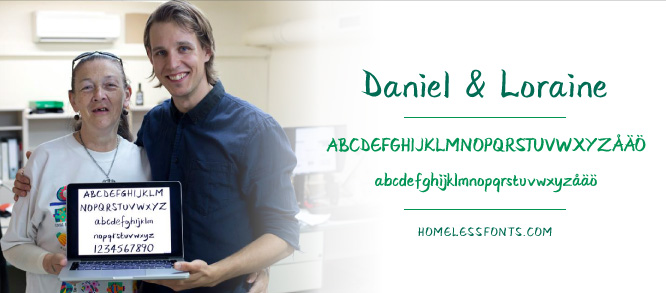
First meeting went very well and after just under one intense hour I was briefed and immediately got to start the process of digitizing Loraines letters, the first of five alphabets. When I started the work I only had 26 capital letters and 26 small letters, all of which where automatically traced and therefore contained almost 1000 points per letter. My first task was to reduce the number of vector points to around 50 points or less per letter so I had to retrace all the letters by hand. My next task was to make the typeface an OpenType Standard containing 243 letters, symbols and punctuation marks. A big majority of these I had to create from scratch by copying and pasting the the existing letters and respecting the characteristics of Loraine's handwriting (which became one of the most interesting and energy feeding part of the process).

Here you can see the differences in the first and last version.
In about a week and a half of intense labour I had a presentable font that was sent to Monotype (who had entered the project as promotional and technical support) some last tweaks. They loved the font and the work I had done. So the next day as part of the presentation of the project, together Ferran Busquets of Arrels Fundació, Bill Davis of Monotype and Loraine from Homelessfonts, I presented the work I had done.

Me and Ferran Busquets from Arrels answering questions at AtypI conference about the Homelessfonts project. [Photo: Juan Lemus]
Here you can find the font on MyFonts.com, Linotype.com and Fonts.com.
Now awaits more interesting work with the other people from Homelessfonts; Fransisco, Gemma, Jose Luis, Guillermo.
Stay tuned for more info.